
The short version
- Localization is not translation. Translation is the thinnest layer. Currency, dates, payment methods, the argument you make, and the room you left for text all have to change too.
- Product UI, logo, pricing, and the shape of the claim belong at the top of your keep-as-is list. If your pipeline is allowed to redraw them, check every item before the ad goes live.
- German, French, and Russian strings run longer than English, and Japanese needs more vertical room. A layout with no slack breaks the moment it's translated. Most common failure, and the dumbest.
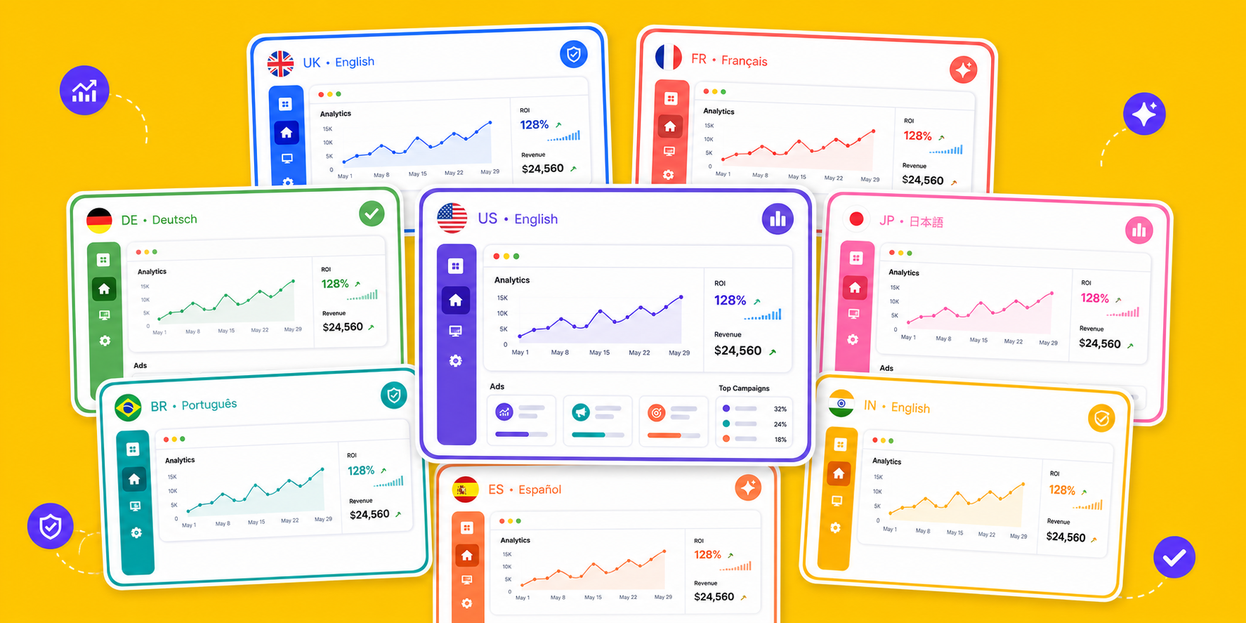
Localizing SaaS ad creative is not translation. Currency, dates, payment methods, the argument you make, and the slack in the layout all change per market, while the product UI, the logo, the pricing, and the shape of the claim stay on the keep-as-is list. German, French, and Russian run longer than English and Japanese needs more vertical room, so a tight layout breaks on contact.
Most teams localize like this: run the ad copy through a translation tool, export, ship. Then they wonder why nobody in Japan clicks.
The words changed. The argument didn't. What convinces a buyer in Tokyo isn't what convinces one in Austin, and translating the same reasoning into a new language means you're still making the American pitch, only harder to read. Here's how to do it properly.
Localization is not translation: what actually has to change
Pull "localization" apart and there are at least four layers. Translation is the outermost one — Microsoft's localization overview draws the same line, treating translation as one subset of the work rather than the whole of it:
- Language. The words. Easiest layer, and the easiest to get right.
- Format. Currency symbol, number formatting, date order, units, which payment methods you name. Is it $19.99, €19,99, or ¥2,900? Get this wrong and it's the first thing a local reader notices.
- Argument. What each market actually believes. Japan weights trust signals and specifics; North America responds to a direct outcome claim. Hardest layer, and the one worth the most.
- Culture. Whether the models, settings, colors, and metaphors read as local. An ad that visibly wasn't made here loses half its credibility before anyone reads the headline.
Most teams stop after layer one and ship. Then the numbers come back soft, which is exactly what you'd expect.
A market-by-market checklist: Japan, SEA, Europe
Here's what we've collected from campaigns we actually ran. Not exhaustive, just the things that moved conversion:
| Market | Main languages | What matters most |
|---|---|---|
| Japan | Japanese | Trust signals (customer logos, hard numbers), higher information density is fine, correct politeness register, layout must absorb longer strings |
| Southeast Asia | Indonesian / Thai / Vietnamese / English | Mobile-first, price-sensitive, name the local payment method (e-wallets, bank transfer), one language per country, never a blended set |
| North America and Europe | English / German / French | Lead with the outcome, keep the copy short, watch the privacy and data-handling wording, and design for German and French running long |
| Russian-speaking markets | Russian | Russian runs noticeably longer than English, so the layout needs headroom before the copy is written |
One more note on Japan. US-style ads run on a single big headline and a lot of white space. Send that same restraint into Japan and it often reads as thin, like you couldn't be bothered to explain yourself. Japanese buyers sit with detail longer, and trust signals (who else uses this, how many companies, the exact number) earn attention instead of cluttering the frame. That's an observation from our own projects rather than a measured finding — worth testing yourself before you commit a market to it.
One master, four languages: how we actually did it
Here's a real one. A multi-account browser tool, the kind agencies use to keep dozens of ad accounts separated, had one English creative that was performing. They needed Japanese, German, and Russian versions of it. The standard route is three designers rebuilding the same ad three times.
What we did instead: lock the master, freeze the product UI and logo, and let the model change only language and scene. One fan-out, four versions.
Here's exactly what we locked and what we let move:
| How it's handled | |
|---|---|
| Product screenshots, logo | Frozen. Never passes through the model. |
| Layout, position of the hero element | Kept. Every language version sits on the same frame. |
| Headline and body copy | Rewritten for the target language, not translated word for word. |
| Scene, lighting, mood | Regenerated per market. |
| Price, currency, local phrasing | Swapped per market, checked by a human before launch. |
Image Fission ships with Chinese, English, Japanese, Russian, and German among its baseline markets, and you pick how far each fan-out is allowed to go: hold the layout, hold the creative DNA, or hold the product facts. Generation models can still drift on small details, so brand names, UI, pricing, and localized strings are all worth a look before anything goes live.
The detail everyone misses: text expands
This is the one that quietly wrecks layouts: the same sentence is not the same length in two languages.
Take your English headline as the baseline. German and Russian both come back longer, and the counterintuitive part is that the shorter the string, the worse the ratio. W3C's estimate table puts an English string of ten characters or fewer at 200% to 300% of its original width once translated; only past about 70 characters does it settle near 130%. Headlines, labels, and button text are exactly those short strings. Japanese uses fewer characters, but each one is wider and wants more line height, so the space you think you saved isn't space you get back.
So don't pick one percentage and apply it to everything. Size the slack by field instead: assume buttons and short labels can double, and give subheads and body copy something closer to a third more room. Don't wait for translations to come back before finding out the headline doesn't fit — at that point you're rebuilding the layout, not editing it. And if the Middle East is anywhere on the roadmap, length is the smaller problem: direction flips too, and Apple's right-to-left guidance is a good short read on which elements should mirror and which ones (charts, media controls) shouldn't.
How deep should you go?
Don't overcorrect either. Not every market earns a rebuild. We decide on two questions: how big is this market for us, and how far is it from the one we already know?
- Big market, far culture (a US team entering Japan): rework the argument and the visual world. Worth the time.
- Opportunistic, close culture (English is done, now adding Australia or Ireland): adjust language and format, then stop.
Match the effort to the return. Put real work into the two or three markets that carry the number, cover the rest with a constrained fan-out, then spot-check what shipped. That trade beats pretending you can hand-build every market. China still needs a channel-specific layout decision: most Xiaohongshu image posts start from the 3:4, 1080×1440 cover spec. If you want this as a repeatable motion, the SaaS teams going global breakdown goes deeper.
FAQ
What's the real difference between translation and localization?
Translation swaps words. Localization also swaps currency, date format, payment methods, the persuasion angle, and the cultural cues in the image. The same benefit can need a completely different framing for a Japanese buyer than for a North American one. Translate only, and you're making your home-market pitch to someone who doesn't share its assumptions. The conversion rate reflects that.
Will the AI mangle our product UI when it swaps languages?
Not if the setup is right. In Image Fission the product screenshots and logo are frozen and never pass through the model, so however many languages you generate, the product looks identical to the master. Only the copy and the surrounding scene change.
Which markets deserve deep localization first?
The ones that are both large for you and culturally distant. A US team entering Japan is the clear case, where the argument and the visual cues both justify a rebuild. Markets you're covering opportunistically and that already sit close to your home culture only need language and format cleanup. Spending more there is spending it in the wrong place.