
The direct answer
- For most Xiaohongshu and RedNote image posts, start with a 1080×1440, 3:4 portrait cover. At the same column width it occupies roughly 33% more feed area than a 1:1 square.
- A widely copied error: "3:4 means 1080×1350." That ratio is 4:5. Real 3:4 is 1080×1440.
- Keep the product UI, headline, and logo clear of the upper and lower crop risk. A cover should carry one readable takeaway, not the full product story.

For most Xiaohongshu (RedNote) image posts, use 1080×1440 px at 3:4. It is the reliable default for a two-column discovery feed: more visible area than a square cover, enough vertical room for a SaaS screenshot, and a clearer place for the one point a reader should retain. Get the ratio and safe zones right before worrying about the caption.
The sizes first, then the part people skip: how a note actually gets found.
Xiaohongshu cover size: use 1080×1440 at 3:4 by default
If you keep one number, keep this one: 1080×1440, 3:4 portrait. In 2026 it's the ratio that occupies the most feed real estate on Xiaohongshu, and it's what nearly every top account publishes.
The reason is layout. Explore is a two-column masonry feed with a fixed column width. At that same width, a 3:4 card runs taller than a 1:1 square, about 33% more vertical space. More area means a clearer subject, a more legible headline, and a better chance someone stops scrolling.
One correction, since this gets copied around a lot: several guides claim 3:4 is 1080×1350. Divide it out. 1080/1350 is 4:5, not 3:4. Real 3:4 is 1080×1440. Use that.
The full size table
The other ratios aren't wrong, they're situational:
| Use | Size | Ratio | When |
|---|---|---|---|
| Cover / in-post (default) | 1080×1440 | 3:4 | Almost always |
| Dense infographic | 1242×1660 | 3:4 | Many small elements, needs extra sharpness |
| Landscape | 1080×810 | 4:3 | The content is genuinely horizontal |
| Square comparison | 1080×1080 | 1:1 | Side-by-side before/after |
| Video | — | 9:16 | Video notes |
One hard rule: a single note supports one ratio only, no mixing. Pick 3:4 and every image in that note is 3:4.
Where these numbers come from. Xiaohongshu has never published a creator-facing image spec document — there's no equivalent of Meta's or Google's placement reference to check against. So every size, safe-zone percentage, resolution floor, and the one-ratio rule in this guide is a measured working figure, not a platform commitment, and any of it can shift with an app update. Preview an important post in your own account before you publish.
3:4 or 1:1? How we decide
This is the question we get most. Our rule: 3:4 by default, and only two things change it.
- The content is horizontal by nature: a landscape shot, a wide table, a 16:9 product screenshot. Forcing it upright distorts it. Use 4:3, or pad the top and bottom to build a 3:4 canvas.
- You need a real side-by-side comparison. A square frame reads better for that.
Everything else is 3:4. That extra 33% of area is real attention in the feed.
Safe zones and resolution: two lines not to cross
Resolution first. Plenty of people pull an image off the web and upload it as is, and web images are often 750px wide or narrower. Xiaohongshu scales them up to display size and they turn to mush. The floor we work to is simple: nothing narrower than 1080px. Start with a 1080×1440 canvas and design at that size. The platform publishes no minimum of its own — this one is ours.
Then safe zones. A 3:4 cover shows in full on Explore, but it gets cropped when the note is shared to WeChat or displayed on your profile grid. What we measure out is about 10% clear at the top and bottom, roughly 144px each, with the main headline in the upper-middle of the frame. The band between Y 300px and Y 600px holds up best in practice, high enough to stay clear of the like and save icons and the note title the app overlays along the bottom. These are numbers we arrived at by measuring renders on our own devices, not published specs, so treat your own preview as final.
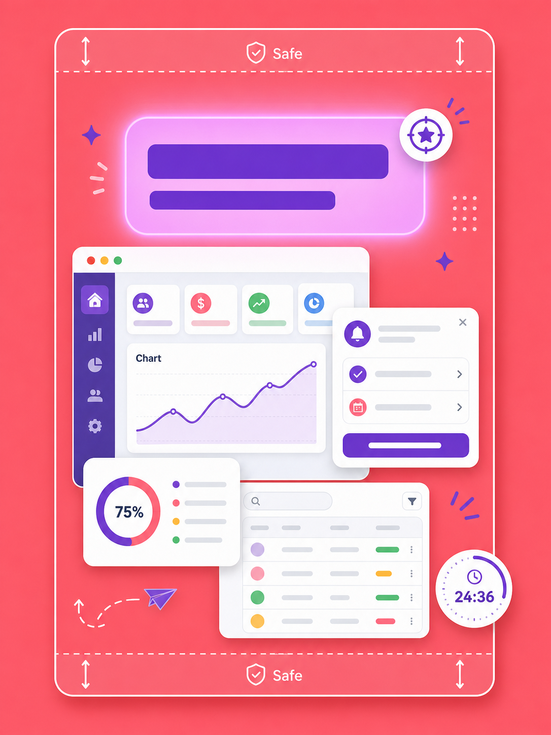
A common beginner mistake is packing the cover with small text. Feed thumbnails are small, and in our own tests anything under about 40pt stops being readable at that scale — an eyeball threshold from common handsets, not a platform rule. Put one conclusion on the cover and move the detail inside.
Getting found: covers don't do that job
This is where most of the platform's value gets left on the table. A note has two ways in: Xiaohongshu's own search, and Baidu, which indexes notes and surfaces them to people who never opened the app. Both run on text. Neither runs on your images.
- Don't count on text inside the picture being read. Take how Google indexes images as the reference case: it works from the filename, the alt text, and the copy surrounding the image rather than from the words printed inside it. Neither Xiaohongshu's own search nor Baidu documents what it does here, but baking keywords into cover art is not a route worth planning around.
- What decides whether you get found is the keywords in the title and body copy. If you want to show up for "multi-account management" or "cross-border SaaS tools", those phrases have to appear naturally in the title and the first few lines, and in Chinese, because that's what people are typing.
- The first 20 characters are the most valuable space you own. Both Xiaohongshu search results and Baidu snippets show the opening. Front-load it.
Split the jobs. The image earns the stop; the text earns the find. One picture won't do both.
Sizing is only the first decision
3:4 for Xiaohongshu, 4:5 for Meta, 9:16 for TikTok. Ratio is only the first decision. The same SaaS screenshot also needs a different claim, language, and reading order for each market, while the product UI and brand stay accurate.
LinkBloom starts with product information, then produces multilingual, channel-specific marketing creative while keeping the facts you choose protected. You can generate a first creative set from your website, then review the copy and crop before you publish.
For the adjacent production decisions, use the TikTok creative size guide, Facebook & Instagram image sizes, SaaS creative localization workflow, and creative A/B testing playbook.
FAQ
Should a Xiaohongshu cover be 3:4 or 4:3?
3:4 (1080×1440) by default. It occupies the most screen in the two-column feed and it's the right answer in almost every case. Go to 4:3 only when the content is genuinely horizontal and forcing it upright would distort it.
Why is my cover cut off on my profile page?
Explore and the profile grid crop differently, so a 3:4 cover gets trimmed on the grid. The platform publishes no safe-zone spec; about 10% clear at the top and bottom is what holds up in our own testing. Keep the headline and main subject away from the edges and nothing important is lost wherever the image renders.
Will putting keywords in the cover image help me rank on Baidu?
Effectively no. What's printed inside an image isn't the main thing search uses to understand it. Keywords have to live in the title and the body, especially the first 20 characters. The image earns the stop, the text earns the find.
Should I crop a SaaS product screenshot directly to 3:4?
Not if that removes the evidence that makes the product understandable. Decide which UI area must remain visible first, then compose the 3:4 frame around the screenshot, headline, and breathing room. A wide interface can sit inside a portrait layout, or its key workflow can become a short sequence of images. The goal is a cover that explains the product job at a glance, not one that squeezes in every panel.